In the digital age, your website often serves as the frontline ambassador for your business. It can profoundly influence customer behavior and decision-making. Understanding the pivotal role of “responsive website design” (mobile website design) is essential for any business looking to thrive online. Let’s explore how a strategic web design can become your most powerful tool in boosting sales.
Responsive Website Design Services“The Power of First Impressions”
In the realm of online sales and marketing, first impressions are critical. It takes just a fraction of a second for visitors to form an opinion about your website that determines whether they’ll stay or leave. This snap judgment can be the difference between a sale and a missed opportunity, making the initial impact of your website’s design a top priority.
Captivating Visual Design
Visual appeal is paramount when it comes to attracting and retaining visitors. A captivating visual design is the cornerstone of making an excellent first impression. Here’s how to ensure your design hits the mark:
Color Psychology: Colors have the power to evoke emotions and actions. For instance, blue can convey trust and security, often used by financial institutions, while orange can create a sense of urgency, which might encourage impulse buying.
High-Quality Images: Crisp, professional images can significantly enhance your product’s perceived value and the professionalism of your website. They allow customers to visualize themselves using the product, which can be a powerful motivator for making a purchase.
Thoughtful Layout: A well-organized website guides visitors effortlessly to the information they need. Attention to white space, typography, and the strategic placement of elements can direct attention and prevent information overload, which can be a significant deterrent for potential customers.
By meticulously crafting these visual elements, your website becomes an inviting space that encourages further exploration.

Intuitive Navigation
The ease with which visitors can navigate your website is vital for steering them through to conversion:
Logical Structure: Your site should have a logical structure with a clear hierarchy, making it easy for users to navigate from general content to more detailed information without getting lost.
User-Friendly Menus: Menus should be simple and easy to understand, offering quick access to different sections of your site. Dropdowns can be useful for organizing content without overwhelming users.
Search Functionality: Including a search bar can significantly enhance the user experience, allowing visitors to bypass navigation and go directly to what they are looking for, which is particularly useful for e-commerce sites.
Intuitive navigation minimizes user frustration and makes it easier for visitors to make a purchase, directly contributing to your sales figures.
Fast Load Times
Website load time is a critical, often overlooked aspect of web design:
User Expectation: Most web users expect a site to load in 2 seconds or less. After 3 seconds, many will abandon a site out of impatience.
SEO Rankings: Search engines like Google consider load times when ranking websites, meaning slower sites are less likely to appear at the top of search results.
Conversion Rates: Studies show that faster load times correlate with higher conversion rates. Even a one-second delay can significantly impact sales.
Optimizing images, leveraging browser caching, and minimizing the use of complex scripts can improve load times, ensuring that your visitors stay engaged.
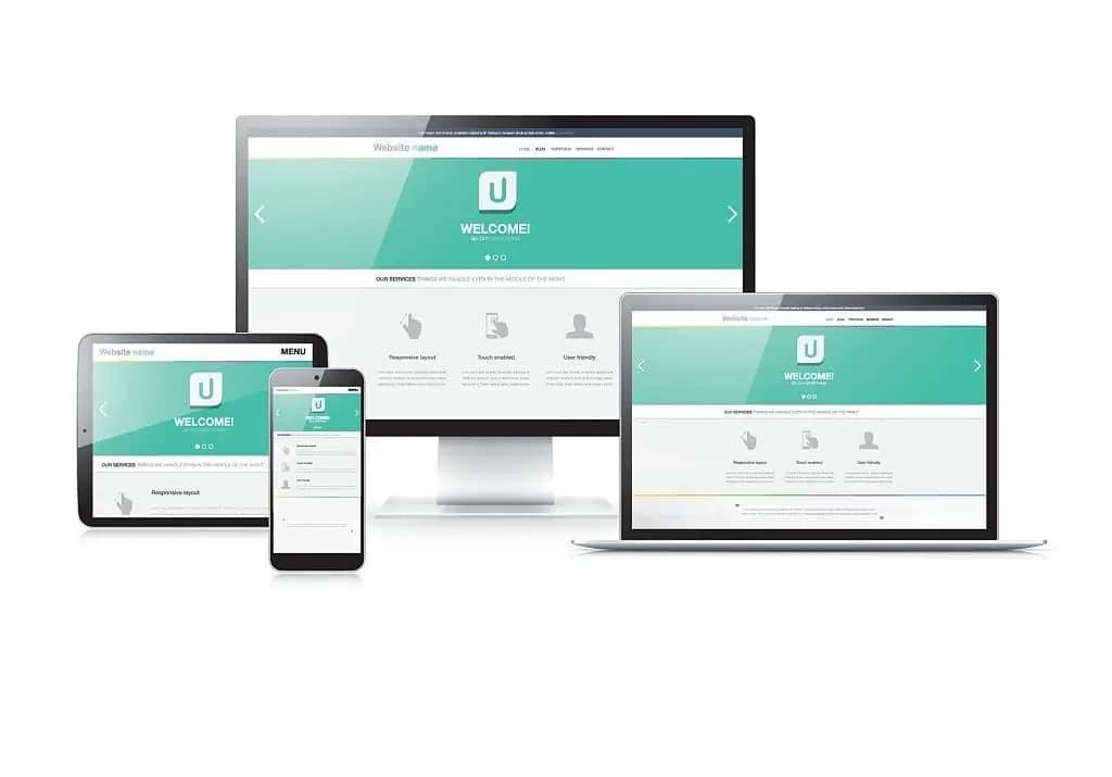
Mobile Website Design
Mobile responsiveness is no longer optional; it’s a necessity:
Growing Mobile Usage: With the majority of internet traffic coming from mobile devices, a website must perform flawlessly on smartphones and tablets.
Google’s Mobile-First Indexing: Google now uses the mobile version of content for indexing and ranking. A non-responsive design will not fare well in search results.
User Behavior: Users are more likely to purchase from a mobile-friendly site. If your site isn’t optimized for mobile, you’re likely losing out on a significant portion of sales.
A responsive design adapts to various screen sizes and resolutions, providing a consistent and accessible experience across all devices.
Incorporating these elements into your website’s design is not just about aesthetic appeal; it’s about creating a user-friendly environment that leads to a positive user experience, fostering trust, and ultimately, increasing sales.
Building Trust Through Professionalism
Trust is the foundation of any successful online business. When customers trust your brand, they’re more likely to make a purchase. A professional, well-designed website is crucial in building this trust. Every element of your site needs to reinforce the professionalism of your business to convert visitors into loyal customers.
- Consistent Branding
Consistency in branding goes beyond just using the same logo on every page. It’s about creating a cohesive experience that aligns with your brand’s values and personality. Here’s how to ensure your branding is consistent:
Visual Identity: Use a consistent color scheme, typography, and graphical elements throughout your site. These should match your company’s logos, packaging, and any physical locations to strengthen brand recognition.
Tone of Voice: The language used on your site should reflect your brand’s personality, whether it’s professional, casual, friendly, or authoritative. This tone should be consistent across all content, from product descriptions to blog posts.
Brand Message: Clearly communicate your brand’s core message and value proposition on your website. Visitors should immediately understand what your brand stands for and what sets it apart from the competition.
When your branding is consistent, it not only looks professional but also makes your business more memorable to customers, which can encourage repeat purchases and increase sales.
- Credibility Signals
To convert visitors into customers, you need to prove that your business is credible and trustworthy. Here’s how you can signal this on your website:
Testimonials and Reviews: Customer testimonials and reviews can be persuasive. Display these prominently to show that real people have had positive experiences with your products or services.
Case Studies: In-depth case studies can demonstrate your business’s ability to deliver results. They show prospective customers that you have solved problems similar to theirs in the past.
Trust Badges: Security badges, industry accreditations, awards, and memberships can reassure visitors that your site is safe and that your business is recognized by industry leaders.
By prominently displaying these credibility signals, you provide social proof to potential customers, reducing their perceived risk and making them more comfortable making a purchase.
- Up-to-date Content
The content on your website should reflect the latest information about your products, services, and industry. Here’s why keeping content fresh is essential:
Reflects Active Business: A site that is regularly updated suggests that your business is active and focused on meeting customer needs.
SEO Benefits: Regularly updated content can improve your search engine rankings, making your site more visible to potential customers.
Thought Leadership: Providing valuable content, such as how-to guides, industry analysis, and insights, can establish your brand as an authority in your field.
An active blog or news section can be an excellent way to keep content fresh, attract organic traffic, and keep customers coming back to your site.
- Clear Contact Information
Accessibility is key in building trust. Customers should be able to contact you easily if they have questions or need support. Here’s what to consider:
Visibility: Contact information should be one of the most accessible pieces of content on your website. Consider placing it in the header, footer, or as a floating element on the page.
Contact Options: Provide multiple ways for customers to reach out, such as phone, email, contact forms, and possibly a chat function. This variety allows customers to choose their preferred method of communication.
Response Time: Make sure you respond to inquiries quickly. Fast response times show that you value your customers and their experience with your brand.
By providing clear and accessible contact information, you reinforce the message that you are ready and willing to assist customers, which is vital for building long-term customer relationships and trust.
By focusing on these elements, you can ensure that your website not only attracts visitors but also provides them with the reassurance they need to become paying customers. A professional appearance, backed by consistent branding and trust signals, sets the stage for a trustworthy online presence that can lead to increased sales and customer loyalty.
Enhancing User Experience (UX) to Encourage Sales
User Experience (UX) plays a pivotal role in converting visitors into customers and ensuring they return for more. By streamlining the journey from landing page to checkout, you create a smooth pathway for users that directly impacts sales. Let’s delve into the aspects of UX that can significantly boost your sales numbers.
- Streamlined Checkout Process
A streamlined checkout process is often the deciding factor between a sale and an abandoned cart. To optimize this process, consider the following:
Simplicity: The checkout should be as simple as possible. Eliminate any unnecessary fields or steps that could discourage a customer from completing their purchase.
Payment Options: Offering a variety of payment options caters to the preferences of different customers, whether they prefer PayPal, credit cards, or newer options like Apple Pay or cryptocurrency.
Guest Checkout: Forcing users to create an account can be a barrier. Providing a guest checkout option can speed up the process and reduce abandonment.
Assurance: Clearly display security badges and reassurances about secure payments to build confidence during the checkout process.
By refining the checkout experience, you minimize friction points, making it more likely that a customer will complete their purchase, thereby directly increasing sales.
- Personalized Experiences
Personalization can transform a generic shopping experience into one that feels bespoke and considerate. Here’s how personalization can play a role:
Recommendation Engines: Use customer data to recommend products tailored to their interests and previous shopping behavior.
Targeted Offers: Provide special deals or discounts based on the customer’s browsing history or purchase patterns.
User-Friendly Interface: Remembering customer preferences on your site can make their shopping experience more intuitive and less time-consuming.
Personalization makes customers feel understood and valued, which not only enhances their shopping experience but can also lead to higher conversion rates and repeat business.
- Calls-to-Action (CTAs)
CTAs are the signposts that guide users on what to do next. They are critical for driving sales:
Visibility: CTAs should be prominently placed and stand out from the rest of the page content.
Urgency: Use language that creates a sense of urgency or excitement, prompting users to take action immediately.
Testing: Regularly test different CTA buttons, colors, and positions to determine which combinations result in the highest conversion rates.
Effective CTAs remove ambiguity about what to do next, nudging customers towards the checkout.
- Live Chat Support
Live chat support can significantly enhance UX by providing immediate assistance:
Availability: Make sure live chat is easily accessible throughout the website, especially on pages where customers are making purchasing decisions.
Proactive Assistance: Use triggers based on user behavior to offer help when customers seem to be hesitating or encountering issues.
Training: Ensure your support team is well-trained and knowledgeable about your products to provide quick and accurate assistance.
Live chat can resolve questions or issues in real-time, providing a personal touch and reducing the likelihood of cart abandonment.
Optimizing for Conversion Rate
- Analytics and Testing
Employing analytics tools helps understand user behavior, while A/B testing various design elements can optimize your site for higher conversion rates.
- SEO Practices
Implementing solid SEO practices ensures your site is found by potential customers. Incorporate relevant keywords, meta descriptions, and alt tags to improve visibility and attract quality traffic ready to make a purchase.
- Social Proof
Integrate social media on your website to showcase customer interaction and feedback. This social proof can influence purchasing decisions and boost sales.
- Security Measures
A secure website with SSL certification protects customer data and enhances trust, directly impacting sales figures as customers are more likely to make purchases on secure sites.
- Leveraging Video Content
Incorporate video content to engage customers. Product demonstrations and testimonials can be powerful sales tools, increasing dwell time and engagement.
- Easy Information Access
Ensure that information about products or services is easy to access and understand. FAQs and detailed product descriptions can aid in this regard, effectively removing barriers to sale.
- Regular Updates and Offers
Keep customers coming back with regular updates and special offers. Highlight these promotions on your homepage for maximum visibility.
- Strong Brand Messaging
Your brand message should resonate throughout your responsive website design, emphasizing the unique value proposition of your business.
By integrating these strategies into your “responsive website design,” you not only enhance user experience but also create a powerful engine for business growth. Remember, your website is an investment; dedicating resources to its design and functionality can lead to a significant increase in your sales numbers.
For further insights on web design best practices, explore resources like Smashing Magazine, Web Design Ledger, or stay updated with the latest trends on Awards. Additionally, to ensure your design aligns with your sales goals, consider consulting with professional web design services or checking out platforms like Behance for inspiration.
In conclusion, a well-thought-out responsive website design is more than just aesthetics; it’s a comprehensive strategy aimed at driving sales and growth. By focusing on the user experience, trust-building, and conversion optimization, your website can effectively turn visitors into customers, time and time again.
What is responsive site design?
Responsive site design is an approach to web design and development that ensures a website adapts and displays properly on various devices and screen sizes, including desktop computers, laptops, tablets, and smartphones. It involves creating a flexible layout and using CSS media queries to adjust the design elements and content based on the screen size. This helps to provide an optimal user experience and ensures that the website is easily accessible and usable on any device.
What are the 3 basic things required for responsive web design?
1. Fluid Grids: Use percentage-based widths instead of fixed pixel widths for elements on your website, allowing them to adjust and resize proportionally based on the screen size.
2. Flexible Images: Implement CSS techniques like max-width: 100% to ensure that images scale and adapt to fit different screen sizes without distorting or overflowing.
3. Media Queries: Utilize media queries in your CSS code to apply specific styles and layout adjustments based on the characteristics of the device or screen being used to view your website. This helps ensure optimal viewing experiences across various devices and screen sizes.
How do you build a responsive website?
To build a responsive website, follow these steps:
1. Use a mobile-friendly design framework like Bootstrap or Foundation.
2. Start with a responsive layout that adapts to different screen sizes.
3. Optimize images and media files for fast loading on mobile devices.
4. Use CSS media queries to adjust the layout and styling based on screen size.
5. Ensure that all text and content are legible on smaller screens.
6. Use fluid grids and flexible images to allow content to resize dynamically.
7. Test your website on various devices and screen sizes to ensure responsiveness.
8. Implement responsive navigation menus and buttons for easy mobile navigation.
9. Make sure your website loads quickly on mobile devices by optimizing code and caching.
10. Continuously monitor and update your website to ensure it remains responsive as new devices and screen sizes emerge.