In the realm of digital interaction, mobile devices have emerged as the front-runners in how users engage with online content. A mobile responsive website has transitioned from a nice-to-have to an absolute necessity. In this expansive discussion, we’ll delve deep into the multifaceted benefits of a mobile-responsive website, why it should be a priority, and how it aligns with a user-centric approach to web design.
Understanding a Mobile Responsive Website
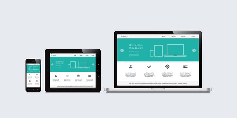
What is a Mobile Responsive Website
User Experience Across Devices
The key aim of a mobile responsive website is to ensure that a visitor has a seamless experience no matter what device they are using. It’s about maintaining functionality, ensuring ease of navigation, and delivering content in a readable and accessible format without the need for pinching, zooming, or scrolling horizontally. It encompasses:
Legible text sizes: Text scales to be readable on small screens without requiring zooming.
Navigation tailored to touch: Menus and buttons are usable with fingers on touchscreens, not just mouse cursors.
Adaptable images and videos: Media scales in size to fit different screens without distortion or excessive loading times.
Content organization: Information is presented in a logical order that flows naturally on any screen size.
This level of responsiveness not only makes a site more accessible to users but also contributes to an intuitive design—where users can navigate and find information effortlessly, regardless of their device.
The Technicalities Behind Mobile Responsiveness
Responsive Web Design (RWD) is the practice of designing a website so that it looks and works well on any device. Here’s how it’s done:
Flexible Layouts
Responsive design uses flexible grid layouts that are defined in relative units like percentages, rather than fixed units like pixels. This allows the layout components to resize in relation to one another depending on the screen size.
Fluid Images
Images are set to have a max-width of 100% of the containing element, which means they scale down according to the size of that element. This is to ensure that images don’t overflow their containing elements and are scaled properly on different devices.
CSS Media Queries
Media queries are a cornerstone technology of RWD. They allow the website to use different CSS style rules based on characteristics of the device the site is being displayed on, most commonly the width of the browser.
CSS media queries enable the page to use different CSS styles for different devices. For instance, you might have one set of styles for screens that are wider than 768 pixels and another set for smaller screens. Here are some of the things that media queries can control:
- Layout changes: For smaller screens, a multi-column layout could shift to a single column.
- Visibility: Certain elements might be hidden on smaller screens to simplify the interface.
- Font sizes: Text might be made larger on smaller screens for better readability.
- Touch elements: Buttons might be made larger on smaller screens to accommodate finger touch instead of a mouse cursor.
Through the use of flexible grids (layout), flexible images, and media queries, a website can be crafted to provide an optimal viewing experience—easy reading and navigation with a minimum of resizing, panning, and scrolling—across a wide range of devices.
The Rising Importance of Mobile Responsiveness
Mobile Usage Statistics
Recent studies show a consistent upward trend in mobile usage. With over half of all global website traffic now coming from mobile devices, ignoring mobile responsiveness is like turning a blind eye to more than half of your potential audience.
Search Engines and Mobile-First Indexing
Search engines, especially Google, have adopted mobile-first indexing. This means that the mobile version of your website becomes the starting point for what Google includes in their index, and the baseline for how they determine rankings. A mobile responsive website is no longer an option—it’s a critical component of SEO strategy.
User Experience and Conversion Rates
A website that functions flawlessly on a mobile device boosts user satisfaction, which in turn can positively affect conversion rates. If your site responds well to their device, users are more likely to engage with your content and take desired actions.
The Benefits of a Mobile Responsive Website
- Enhanced User Experience (UX)
A mobile-responsive website provides a superior user experience. This is because it allows users to navigate and interact with your site with ease, no matter their device. Such a positive UX can lead to increased time on site, lower bounce rates, and more.
- Improved Search Engine Ranking
As a mobile responsive website is pivotal for mobile-first indexing, it’s also a key player in your search engine ranking. Websites that are not mobile-friendly are often penalized by search engines, resulting in lower visibility.
- Faster Page Load Speed
Mobile responsive sites often load faster on mobile devices, reducing the likelihood of users bouncing away due to impatience. This is essential, as a delay of mere seconds can lead to a significant loss in conversions.
- Competitive Advantage
By ensuring your website is mobile-responsive, you’re staying ahead of competitors who have not yet adopted this essential feature. This advantage can be the deciding factor for a customer choosing between your services or another’s.

Implementing Mobile Responsiveness in Web Design
Key Elements of Mobile Responsive Design
Designing a mobile-responsive website requires a focus on several fundamental elements that contribute to a mobile-friendly user experience:
Touch-friendly Navigation: Menus and buttons should be easy to navigate using touch; this means they need to be large enough to be tapped with a finger without the risk of hitting the wrong link.
Readable Font Sizes: Text should be easily legible on small screens without the need for zooming in, which often leads to poor user experience.
Optimized Images: Images must be optimized to load quickly on mobile devices, without compromising on quality, and should be fluid to scale with the varying screen sizes.
Each of these factors plays a vital role in ensuring your website performs well across all devices, maintaining the quality of user interaction, and potentially increasing conversion rates.
Tools and Techniques for Mobile Responsiveness
To efficiently implement a mobile-responsive design, developers can utilize various tools and frameworks:
CSS Frameworks: Bootstrap and Foundation are popular frameworks that provide a grid system and pre-styled components that are designed to be responsive.
Responsive Testing Tools: Tools like BrowserStack or Responsinator help in testing how a website looks across different devices.
Performance Optimization: Minification tools for CSS and JavaScript, such as UglifyJS or cssnano, can help improve load times on mobile devices.
Employing these tools can help ensure that you’re following best practices and achieving a consistent experience across all platforms.
The Process of Making a Mobile Responsive Website
- Assessing Your Current Website’s Mobile Responsiveness
Before diving into how to make a mobile responsive website, you should evaluate how your current website stands in terms of mobile responsiveness. Google’s Mobile-Friendly Test can provide you with a clear report on issues your site might have on mobile devices.
- Designing for Mobile-First
Adopting a mobile-first design means you start the design process by planning for the smallest screen first and then work your way up to larger screens. This ensures that your website’s design is fundamentally geared towards mobile efficiency.
- Testing Across Devices
Testing is an integral part of ensuring mobile responsiveness. It’s not enough to test on just a few popular devices; you need to consider a wide range of devices with different screen sizes and operating systems. Both automated and manual testing play roles in this process, checking not only visual appeal but also functionality.
- Continuous Optimization and Updates
Mobile responsiveness is not a static achievement. With the constant release of new devices and browsers, as well as updates to existing ones, your website must evolve. Regular audits for performance, new standards in coding, and emerging mobile usage patterns are necessary to keep your website at the forefront of mobile responsiveness.
- Integrating Mobile Responsiveness with Happy Digital
At Happy Digital, we don’t just stop at making your site mobile-responsive; we aim for mobile optimization. This means we carefully analyze user behavior on mobile devices and tailor the experience to match user expectations, ensuring fast load times, engaging content placement, and intuitive interaction.
Our services include a thorough analysis of your existing website, a strategic overhaul to implement responsive design, and rigorous testing to certify that the end product stands up to the demands of modern mobile users. With continuous support and updates, we make sure your website stays compatible with the latest devices and web standards.
By partnering with us, you’re choosing to make your website not only compatible with mobile devices but primed for the mobile-centric future of online browsing.
Final Thoughts on Mobile Responsive Website
Embracing a mobile responsive website is embracing the future of the web. As we steer towards an increasingly mobile-centric world, the significance of having a website that performs flawlessly on every device cannot be overstated. It’s about inclusivity, user engagement, and setting your business up for online success.
In conclusion, a mobile-responsive website is indispensable for any business looking to thrive online. By prioritizing mobile responsiveness, you’re not only aligning with technological advancements but also catering to the evolving demands of your user base.
By integrating mobile responsiveness into your website design, you’re laying a solid foundation for enhanced user experience, better SEO, and ultimately, improved business performance. Explore how Happy Digital can transform your online presence and ensure your website excels in the mobile-centric world of today.
How do you make your website mobile responsive?
To make your website mobile responsive, you can follow these steps:
1. Use a responsive design framework or theme: Choose a website design that is already mobile responsive, or use a responsive framework like Bootstrap or Foundation.
2. Optimize your images: Compress and resize images to ensure faster loading times on mobile devices.
3. Implement media queries: Use CSS media queries to define different styles for different screen sizes. This allows your website to adapt and display properly on various mobile devices.
4. Use a mobile-friendly navigation menu: Create a navigation menu that is easy to use on smaller screens, such as a collapsible menu or a hamburger menu.
5. Ensure readability: Adjust font sizes, line spacing, and contrast to improve readability on mobile devices. Avoid using small fonts that may be difficult to read on smaller screens.
6. Simplify your content: Consider removing unnecessary content or condensing it for mobile users. Focus on the most important information and make it easily accessible.
7. Test on multiple devices: Use online tools or physical devices to test your website’s responsiveness on various screen sizes and browsers.
Remember to regularly check and optimize your website for mobile responsiveness to ensure a smooth user experience for mobile users.
What is the difference between mobile-friendly and mobile responsive?
Mobile-friendly and mobile responsive are terms used to describe websites that are optimized for mobile devices.
Mobile-friendly means that a website is designed to be easily viewed and navigated on a mobile device, such as a smartphone or tablet. It typically involves making the website’s layout and content fit well within the smaller screen size of mobile devices.
Mobile responsive, on the other hand, refers to a website design approach that automatically adjusts the layout and content based on the screen size of the device being used. A responsive website will adapt and reorganize its elements to provide the best user experience across different devices, including mobile devices.
In summary, mobile-friendly refers to a website that is specifically designed to work well on mobile devices, while mobile responsive describes a website design technique that adapts to various screen sizes, including mobile.
What is the difference between mobile website and responsive website?
A mobile website is a separate version of a website specifically designed and optimized for mobile devices. It often has a different URL (e.g., m.example.com) and may have a simplified layout and fewer features compared to the desktop version.
A responsive website, on the other hand, is a single website that automatically adjusts its layout and design based on the screen size and device being used. It adapts to provide an optimal user experience on various devices, including desktops, tablets, and mobile phones.
In summary, a mobile website is a separate version created for mobile devices, while a responsive website is a single website that dynamically adjusts its layout for different screen sizes.